marmalade.
Always lowercase, always Cormorant Garamond italic. Give it room, keep clear space of at least the cap-height on every side, and never stretch, recolour outside the palette, or add effects.
Pair with the Space Mono descriptor for formal lockups; drop it for casual use.
Cream and ink do the heavy lifting; acid green leads as the signature pop. Pink, lilac and marmalade are punctuation; one accent per moment, never all at once. White is the crisp second neutral for clean surfaces.
Calm, readable body copy for the detail and the everyday.
We become the team.
Warm and personal, never corporate. We talk like the calm, capable friend who has it handled - honest, a little playful, and always on the founder's side. The client is the hero; Marmalade is the team behind them, never a face out front.

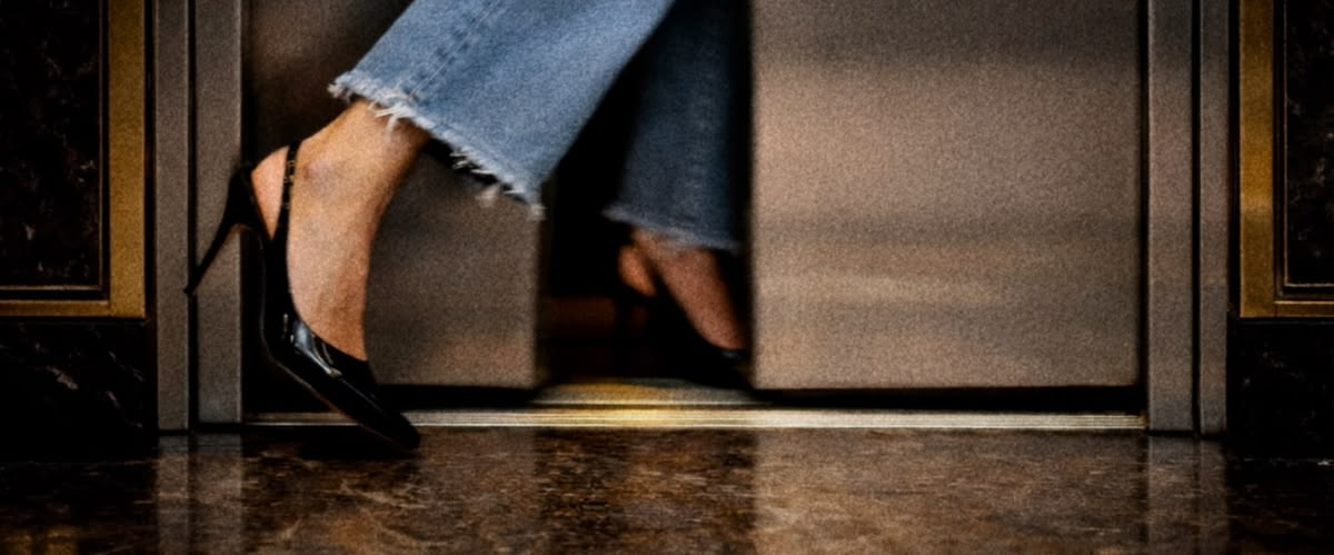
A sample feed — tone, colour, type and photography working together. The photo tiles are placeholders standing in for your real editorial, lifestyle and behind-the-scenes shots; the rest are ready-to-post templates.